Brand
Assets and usage for press, social, and integrations.
Identity
Wordmark
aeqi
Zen Dots, graphite, lowercase. Treated as a single unit.
Brandmark
æ
Compact joined "ae" mark. Used for the favicon, app icon, and square placements.
Anatomy
Typeface
Zen Dots
Weight
400
Tracking
0
Color
#0a0a0b
Clear space
1× æ height
Min size
14px
Favicon glyph
æ
Treatment
Single unit
The four letters share a baseline and are treated as one mark — never split, never restyled.
Typography
Zen Dots
aeqi
Wordmark only. Never body copy.
Ibarra Real Nova
Aa Bb Cc
Display serif — titles only. Sharp, institutional; the one warm voice against the geometry. 400–700.
Exo 2
Aa Bb Cc
Working text — body, sub-heads, eyebrows, UI, names. 300–700.
Geist Mono
0123
Figures only — counts, prices, timestamps, identifiers. Never prose.
Color
Warm marble and charcoal ink — roughly 70% paper, 28% ink, 2% graphite action. One gold signal on top. Depth comes from value contrast, never drop shadows; nothing on the surface is decorative.
Ink
Primary
#0a0a0b / 95%
Titles.
Text
#0a0a0b / 90%
Body copy.
Secondary
#0a0a0b / 65%
Lead, captions.
Muted
#0a0a0b / 48%
Eyebrows, section marks.
Surfaces
Paper
--color-paper
#f4f2ec
The outer shell — warm pale, never grey.
Card
--color-card
#faf9f5
The reading surface — whisper-tinted off-white, not flat white.
Ink slab
--color-ink-card
#0a0a0b
The rare dark moment — brand-weight panels only.
Action
Graphite
--color-accent
#0a0a0b
The one action accent: wordmark, primary CTA, focus, selection. Black means “the thing you do.”
Graphite wash
--color-accent-bg
#0000000f
Translucent wash for pills, callouts, and active state.
Dawn gold
Gold
--color-warmth
#c8973f
The living signal — a running company, a streaming session, the active step.
Gold line
--color-warmth-strong
#a87c2c
Drawn gold lines and rings that must hold contrast.
Gold text
--color-warmth-text
#825e1e
Gold at readout sizes — legible on paper.
The gold law: dawn gold marks only what is alive now. A heartbeat, never a highlighter — it is never brand fill, never decoration, and never the action accent.
Status
Success
#2e8f71
Completed quests, resolved events.
Warning
#b98a47
Warnings and pending states.
Error
#b85c5c
Errors and destructive actions.
Informational states carry no color of their own — they read in ink. There is no blue in the system.
Iconography
Outline strokes, rounded caps, 1.5px weight. Icons inherit color via currentColor.
Do — stroke, not fill. Filled marks are reserved for third-party brand glyphs (GitHub, X, LinkedIn).
Do — inherit color via currentColor.
Don't — mix stroke weights in the same view. For emphasis, adjust opacity, not stroke.
Usage guidelines
Product register — Warm Monument
Inside the product the brand warms: pages are paper, structure is drawn in warm hairlines, and one dawn-gold accent is reserved for what is alive right now. The register is governed by written laws, machine-enforced in the app codebase.
Dawn gold — alive now
#c8973f
Warmth text (AA)
#825e1e
Paper
#f7f4ec
Card elevated
#fffefb
- Gold marks life — only what is alive now wears the dawn. Position is ink.
- Actions are round (pills); surfaces are geometric; seals carry identity.
- Depth is light, not weight — nothing lifts, rings warm.
- Four voices, never a fifth — serif titles, sans working text, mono figures, and the wordmark.
Scenery
The monument at dawn — the hero scenery used on the landing and behind the product's threshold pages (login, founding). Use it washed into the paper by a veil; never as a busy backdrop behind dense UI.
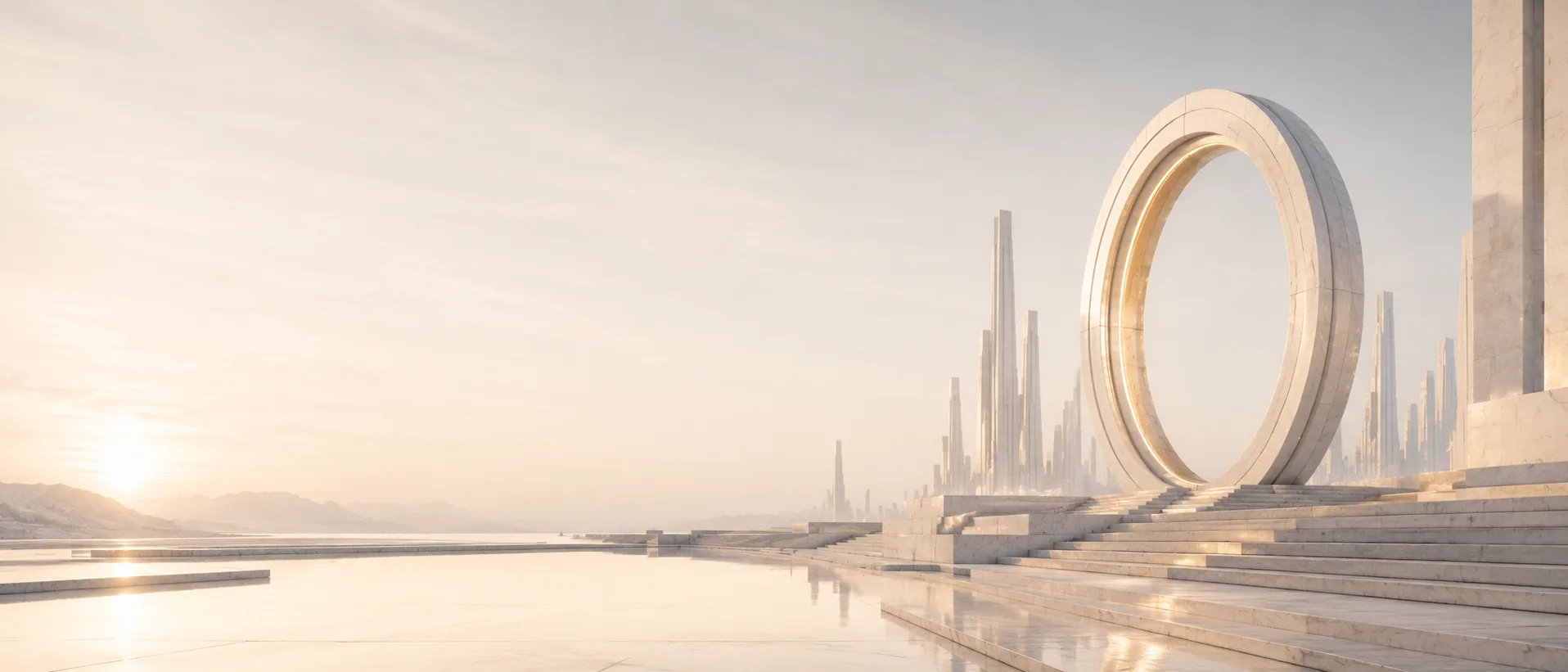
Hero scenery
Download WebP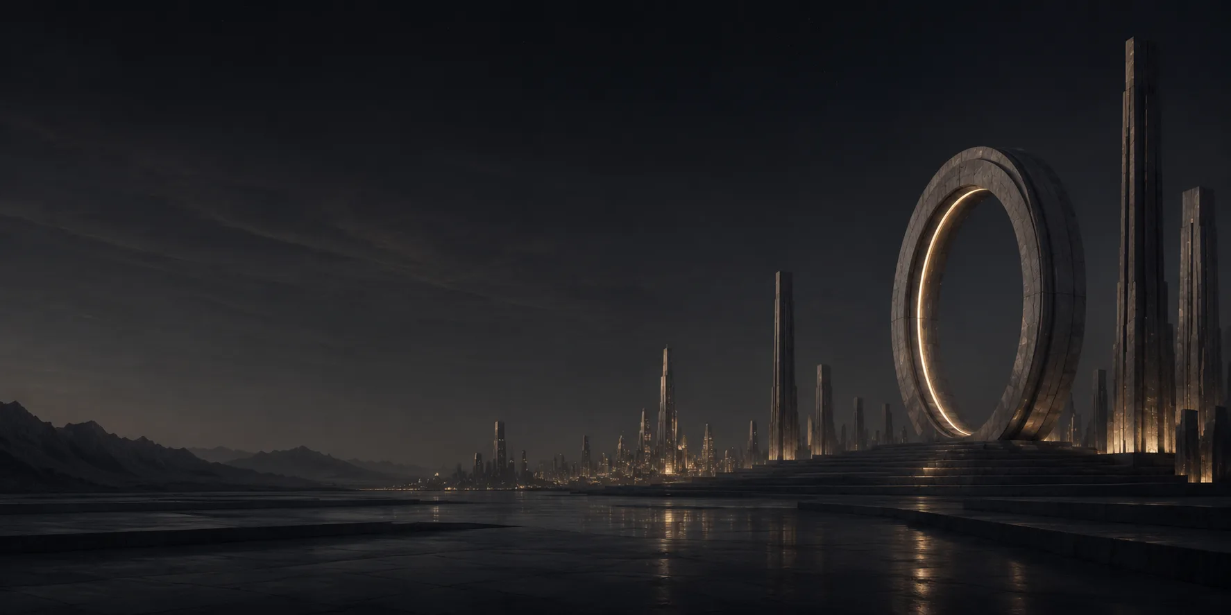
Footer scenery
Download WebPDownloads
Marks & icons
Logo
400 × 400px — white
Logo — Paper
400 × 400px — paper
Logo — Dark
400 × 400px — graphite
Icon
512 × 512px — white
Icon — Dark
512 × 512px — graphite
Favicon
512 × 512px — transparent
Banners & social
Open Graph Image
1200 × 630px
LinkedIn Banner
1584 × 396px — right-aligned for profile photo clearance
X / Twitter Banner
1500 × 500px